Design
Basically Why Figma Is Taking Over the World
Increasingly one of the hardest roles to hire for is product design across enterprise software. The reason for this is as the “consumerization of IT” continues to occur, end users expect a certain standard of UI/UX (user interface & experience). With more companies designing products that are end user adopted or influenced, there is a lack of product design talent currently to fill the need.
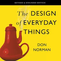
My favorite example of UI/UX in our day to day lives are Norman Doors. I was first introduced to this concept from the Jeli team who told me to read “The Design of Everyday Things”. I highly encourage anyone who hasn’t read it to pick up a copy.
What are Norman Doors? Well you know how you’ll go to a mall or office building and you’ll push when you should pull or vice versa. In some cases, there will even be a bright yellow sticker/sign that says what you should do (an example of mediocre UI and horrible UX). Norman Doors are doors that are designed in an unintuitive manner.
Why the heck do we still have doors that have the same handles on either side! If designers were employed in the process, they would outline that the push side of the door likely shouldn’t have a handle at all while the pull side would. From there, the actions become much more intuitive. You know what to do simply by looking at it (a simple UI and wonderful UX).
Remarkably we still don’t do this in software. In a recent podcast (above), the CEO of Loom described how in the early days, after recording a video, they initially assumed that users would copy the url and use that to share the videos. However, what occurred instead is that people would record the video and then become confused if the video was ready to share. Sometimes, they would even abandon the platform because it wasn’t “easy” to use, even though it was just not intuitive. Loom found out that one of the most impactful things they could do was to add a button once the user hit stop recording that said “Copy your link to share”. This simple button helped inflect user growth and virality as the recordings became shared more engendering more users. Loom thought deeply enough to correct this but many other companies don’t have the time or choose not to prioritize this.
Norman doors are something I think of constantly when using or evaluating a new product. What can be designed to be intuitive? What is the product assuming about the user which then hurts the UX? How can we remove the yellow sticker on the door?
Simple UIs can help lead to wonderful UX.


